
New Upcoming features
Did everyone see the new Upcoming.org awesomeness?
In general, I'm very happy:
- More events in the DB – awesome.
- More configurable searching and filtering – awesome
- Flickr photos – awesome.
- Buddy Icons – awesome
- Better homepage – awesome
- New Event Page – distinctly un-awesome
I'm sorry, but the new event page is just not working for me. There's much more information available now, which is great. Unfortunately, the layout just feels totally wrong. I'm still trying to quantify why, so let me think through it here.
1. The visual hierarchy is wrong. The orange headline gets lost. The red header above and the black type below totally overwhelm it. I would bet that if you got one of those freaky eye-tracking systems, you'd see people scan from top-left-corner, to red header block, to black-on-grey content area, to map, totally skipping the headline. That's what my eyes do, anyway.
2. The informational hierarchy is wrong. The things I want on to know about an event, are, in order: What is it? Where is it? When is it? Who's coming? and Where's the link? Unfortunately, the stuck the "Where is it?" answer over in the sidebar instead of with the item title and date. And they stuck the event link all the way at the bottom.
3. The new attendee/watcher list is awful. It's much easier to scan a vertical column for names you recognize. This overly cramped paragraph-style list is impossible. I do like the big "attendee total" numbers. But they feel like they're in the wrong place.
[LATER]
I got tired of trying to describe the problems. Here's a mockup of how I might change things. Start by looking at it in small size first. That helps you see the relative weight of the information without reading the content. See how much better the black headline is? Notice, I actually just moved bits around. I really do like the general style and color treatment.
P.S. Find me on Upcoming.
Before click for full size |
After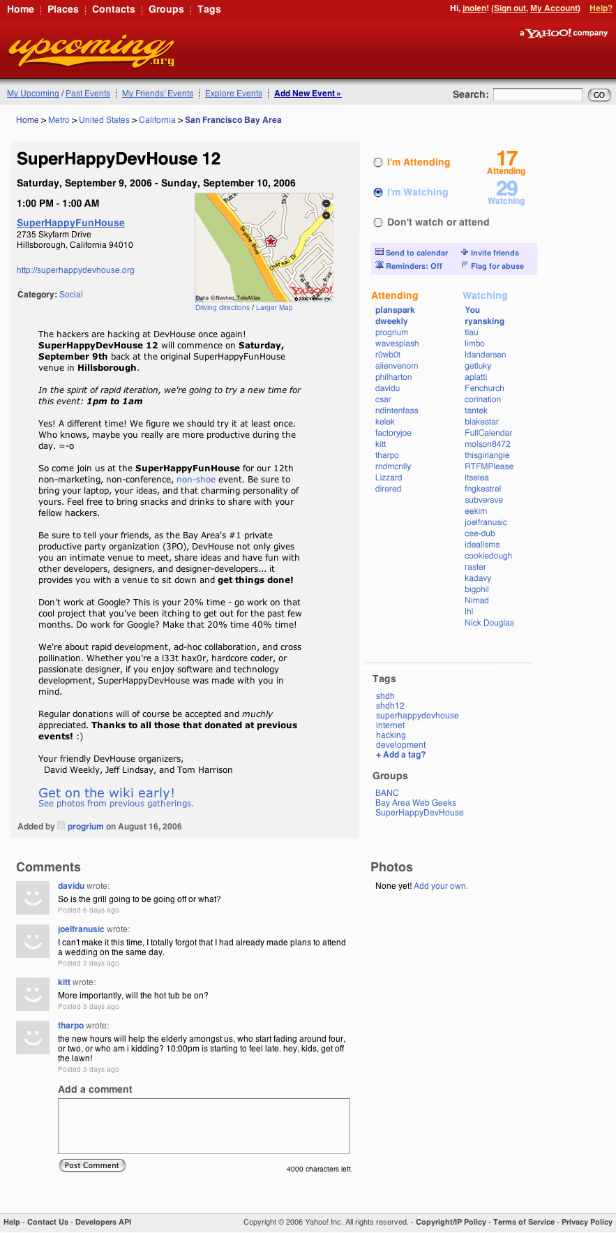 click for full size |
2 Comments
Comments are closed.


See my comments on the Upcoming blog. I’m going to rev the detail page first thing tomorrow based on your mockup. Thanks so much for caring enough to put this together.
I would agree but from a design point of view I would like to see the main text justify and line up with the width of the map and the where is info!
Nice though